Apple-native accessibility engineering

Apps that work for everyone who opens them.

Accessibility is not a patch you apply before review, and it is not a checkbox. It is the same craft as the rest of the build. We design and ship iOS, iPadOS and macOS apps on Apple's own accessibility APIs, so the app behaves properly for the people already relying on VoiceOver, Dynamic Type and Switch Control every day.

  • SwiftUI & UIKit accessibility APIs
  • VoiceOver, Dynamic Type & audio graphs
  • Built for WCAG 2.2 AA & the EAA
Native Apple frameworks VoiceOver, Dynamic Type, Switch Control and audio graphs, handled in the view layer.

Traits, hints, custom actions, status announcements and layouts that hold at every text size, written into the SwiftUI hierarchy rather than bolted on at the end.

1.3bn People worldwide live with a significant disability, around one in six of us. World Health Organization
VoiceOver Dynamic Type Switch Control Audio graphs WCAG 2.2 AA EN 301 549 Colour vision Voice Control VoiceOver Dynamic Type Switch Control Audio graphs WCAG 2.2 AA EN 301 549 Colour vision Voice Control

Framework work

Across the whole Apple accessibility stack, not just labels on buttons.

Apple ships the best accessibility infrastructure on any platform. Most of the gap between a compliant app and a genuinely usable one is in how carefully those APIs get applied.

01

VoiceOver Ergonomics

Semantic elements, custom traits, sensible container grouping and hints that say something useful, plus status changes announced through UIAccessibility.post rather than left silent. The goal is a screen a blind user can move through quickly, not merely one that reads aloud.
02

Dynamic Type & Layout That Holds

View hierarchies built to survive the accessibility text sizes, not just the default one. We test at AX5, where most apps start truncating labels, clipping buttons and losing whole controls off the bottom of the screen.

03

Switch Control & Motor Access

Support for external switches, AssistiveTouch and hardware keyboards, with visible focus on every control, hit targets that meet Apple's 44x44pt minimum, and a focus order that follows the task rather than the view hierarchy.

04

System Preferences, Honoured

The OS-level switches actually respected: isIncreaseContrastEnabled, isReduceTransparencyEnabled and isReduceMotionEnabled. If someone has turned motion off across their whole phone, your app should not be the one that ignores them.

05

Audio Graphs & Sonification

Charts and telemetry described with AXChartDescriptor so VoiceOver can play the data as an audible pitch sweep, paired with haptics where the Taptic Engine adds something a tone cannot.

06

Voice Control & Custom Actions

Labels that match what a control is called on screen, so Voice Control can address it, and accessibilityCustomActions to collapse a fiddly gesture into a single item in the rotor.

Commercial value

Why accessibility work pays for itself.

Compliance is the floor, not the reason. Accessible apps reach more people, survive procurement, and tend to be better apps for everyone who uses them.

01

A Market Most Apps Quietly Exclude

Every one of those people is carrying an iPhone that already supports them properly. The gap is almost never the device. It is the apps running on it, and that is a gap you can close.

02

The European Accessibility Act

Since June 2025 the EAA has applied to a broad range of consumer digital products and services sold into the EU, with conformance assessed against EN 301 549, which carries the WCAG success criteria across to native apps. Getting there deliberately is cheaper than getting there under a deadline.

03

Editorial and Award Visibility

Apple runs an Inclusivity category in the Apple Design Awards and gives accessible apps regular editorial space on the App Store, particularly around Global Accessibility Awareness Day. It is one of the few things a small studio can compete on directly.

04

Better Apps for Everybody

Legible type, honest contrast, clear hierarchy and motion you can turn off are not concessions. They are the things people mean when they say an app feels well made.

Our own work

Two apps where we had to take our own advice.

Inclusive design tooling

UI Color Palette Designer

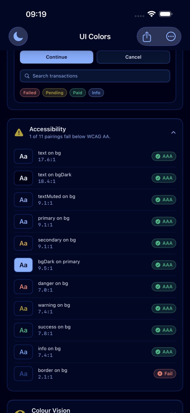
A native iOS tool that grades every pairing in a palette against the WCAG contrast ratios as you build it, with live simulation for protanopia, deuteranopia, tritanopia and achromatopsia.

View project
UI Color Palette Designer contrast grading screen

Accessible routine timing

TimerStack

Built so you never have to look at it: high-contrast type, VoiceOver announcing each step as it starts, haptic pulses at every transition, and Dynamic Type held across iOS and watchOS.

View project
TimerStack interface preview

Services

Three ways this work usually starts.

An audit of what you already have, hands-on remediation, or keeping a shipped app in good shape as iOS and the standards move. Every engagement ends in code and a written record of what changed, not a slide deck.

Audit & report

A screen-by-screen review of your iOS or macOS app against WCAG 2.2 AA, EN 301 549 and the Apple HIG.

Fixed price scope

  • VoiceOver navigation walked screen by screen
  • Dynamic Type tested to the accessibility sizes
  • Contrast and colour vision analysis
  • Findings ranked by severity, with the fix for each

Ongoing upkeep

Keeping a shipped app accessible as iOS versions land and the standards move underneath it.

From £950/month

  • Readiness checks against each major iOS release
  • Accessibility regressions caught before your users find them
  • New strings and screens reviewed as they ship
  • Direct developer access, no account layer

Contact

If your app has an accessibility problem you already know about, let's talk.

An audit of what you have, remediation on a codebase that needs it, or a new Apple product built this way from the first commit. Happy to look at where you are before either of us commits to anything.